A Masterclass In Simplistic Email Design

I’ve written about email design and email templates in past blog posts.
And I believe that email design is more than having over the top creatives and “pretty” emails.
Email design is all about how the components of your email work together to move your reader down that slippery slope of email copy using both images and words.
So for this week’s email breakdown I’m looking at an email from the razor company – Supply.
Their product is simple, but elegant. Basic, but refined. So it would make sense that their emails reflect that same design principle.
Before I jump in, I would love your feedback on these breakdowns. Leave a comment down below or hit me up on LinkedIn and let me know.
As a reminder, every week I am going to pick a different email that I read and that “made me click.” I’ll break down the email from the subject line to CTA and share what I think they did really well.
Hopefully I can share some insights into what makes a really good email and how you can use these insights to improve your click through rates and email conversions.
If you have an email that “made you click” and you’d like me to break it down, shoot me an email at ben@henkenmarketing.com.
Now let’s get onto the good stuff…
Showing Off The Product
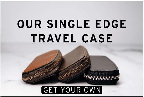
The debate will always rage… images vs. copy for ecommerce.
This is one debate where I think the answer is somewhere in the middle.
And when you can do both… you’ve got a great email.
With this hero image for Supply’s email, they are showcasing the product and getting out of the way.
For anyone who’s a hot prospect looking for a travel case for their razor… this is where they stop reading.
I like the way that the copy and the CTA work together. The CTA isn’t overly clever but it’s also not the generic “Shop Now” either.
Our First Bits of Copy
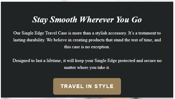
I’m going to ignore that this copy is center aligned… (as much as I can.)
This copy does a great job of building up the perceived value of the product.
“More than a stylish accessory”
“Lasting durability”
“Designed to last a lifetime”
This product is a complementary product and definitely falls into the category of “nice to have.”
Customers buy products to either move away from pain (that’s why you’d buy one of their razors), or to move towards pleasure (like the pleasure of having a stylish, long lasting carrying case.)
This is an example of using copy to shift someone towards pleasure.
By building up the value of the product and showing how it can work to complement your “need to have” product, Supply is removing objections and shifting the customer’s mindset.
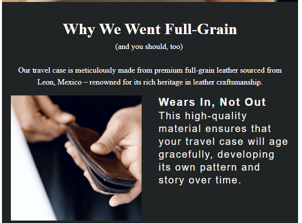
When Possible – Show The Product In Someone’s Hands

A picture says a thousand words. Right?
This image is simple. No copy, no CTA, but it is perfectly placed in the email and does more than a thousand words of copy can.
I’m not an expert when it comes to design, but I know enough to be dangerous…
Our eyes scan an image in the shape of an F.
Across the top, across the middle, across the bottom.
So the placement of the person’s right hand is perfect. As we scan, our eyes find the hand and the fingers lead our eyes right to the carrying case and razor.
At least that’s what my eyes did… 👀
In addition, this image shows off the relative size of the carrying case both in terms of the razor and relative to someone’s hands.
With this image you can begin to see yourself holding the case and you can picture your own razor inside.
Diving Deeper With More Copy
This section builds on what was started in section number two of the email.
I love how supply is continuing with the same theme and emotions, rather than trying to jump around and address every possible objection.
Remember that the focus earlier was on lasting durability and design to last a lifetime.
You’ll notice a theme through these next images and bits of copy.
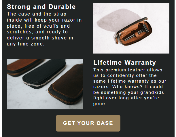
Always follow the rule of one as much as possible when it comes to email.
One emotion, one CTA, one goal.
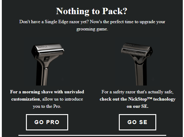
Another design element here before we wrap up.
Notice how the images form a Z pattern here rather than having all of the images down the left and copy on the right.
Something simple, but helps the reader’s eyes move through each section.
Something That I’d Change…
I just mentioned the rule of one right…?
This is where Supply violates that rule.
If you’ve been following me for any length of time, you know that I’m a big believer in segmentation.
So rather than sending this email to everyone on the list or to all engaged subscribers… I would have sent this email ONLY to subscribers who had purchased a razor but had not purchased a travel case.
And then I would have eliminated this last section.
That being said, I don’t know the data on this email. Maybe the appeal of the travel case was enough to get someone who scrolled all of the way down to purchase a razor as well.
Without that data, I can’t make any determinations. Just telling you what I would have done.
The Evergreen Footer

If you have an evergreen value proposition… include it at the bottom of all of your emails.
(Pro-tip, change out the image link to match the link that you’re using for your CTA in each email)
These value props can be anything that increases the value of your product.
“Non-GMO”
“Made in America”
“Free Returns”
You get the idea.
Lessons
That’s a wrap. Let me know in the comments or on LinkedIn what you thought of this breakdown..
Here’s some take-aways.
>>Design is more than high-level creative and “pretty” emails
>>The correct picture can say 1000 words
>>Use the rule of ONE. Stay consistent with your message throughout the email.
Next Steps
- Leave a comment below – what did you think of this email? What did you like or dislike?
- Share this breakdown with someone you know – know anyone with a DTC ecom store? Share this breakdown with them and they’ll thank you for it.
- Follow me on LinkedIn for more content – and connect with me if you are an email marketer, ecommerce business owner, or course creator.
- Subscribe to my email list – and get all my email breakdowns as well as my email tips and tricks sent directly to your inbox.

Leave a comment